For the people that have been following me on twitter for some time or know me in the real world; you will be aware that for the last few years my Girl and I have supported a charity Project Ryton2Ethiopia.
The charity that the project raises money for is the New Day Children’s Centre (charity no – 1117381) and it is in need of a new website.
I’m going to be pulling the site together but I’m not great at certain aspects of web design so I’m asking for help from you… Yes you.
The basics of the website will be a CMS (WordPress is looking like the best option) installation. Also there will be some social network elements. So the help that I will need will be around the theme design, logo design and also background designs for things like a twitter account etc.
The first thing to look at while I set up the WordPress installation is the Logo.
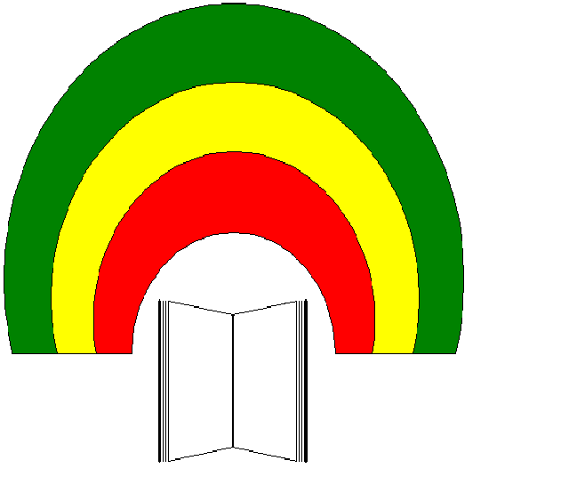
The basic brief for the Logo is that due to existing print material it would need to keep the similar design of the existing logo.
I think the best way to do this is to open it up to you.
Just download the image below; redesign and email back to me( phil (at) smlp .co.uk ).
I’ll update this page with each design as I get them; if everybody could comment below on ideas on what could be done with it or which design you prefer (Once I’ve put them up)
A big thank you for your time and help to everyone that has already offered to help.
UPDATE – 25/01/2010
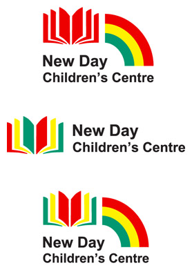
Re-Design 1 – David Sharp – @a303dj
Re-Design 2 – Paul White – @PJ


Unfortunately logo design is my Achilles heel so I’m hoping something else comes up I can be more help with.
Thanks for the interest in helping out.
I guess I just need some body to make the logo a little bit more shiny without changing the “Rainbow and Book” elements.
Am working on it now, hope it helps 🙂
Phil – I’ve put the images here:
http://bit.ly/cngx0L
http://bit.ly/d8XSYv
http://bit.ly/bt3sme
http://bit.ly/djCjZH
Basically I’ve kept it simple. This logo HAS to work in Africa, on site at a place with limited supplies and reproduction options. So the text is in Arial, available on every computer – it’s not the prettiest font but it’s easy to find and easy to match 🙂 Colours are standard palette primaries. I’ve given a few choices, some more simplified on the original theme for comparison. Hope it helps!